Data is used by both organizations and people to uncover problems’ root causes and provide appropriate solutions. Making sense of the ever-increasing volume of data, however, becomes more and more difficult. We have an intrinsic desire to look for patterns and organization. We acquire new knowledge and store it in this way. Finding structure and recognizing these patterns can be challenging or even impossible when incoming data is not visually appealing.
We’ll examine how data visualization can be used to address the aforementioned issue in this article. In addition, we’ll discuss what data visualization is, why it’s crucial, how to improve your data visualization abilities, typical graphs, and tools you can use to simplify the process of displaying your data.
What is Data Visualization?
Data visualization is the graphic representation of data. Putting data into a visual context is what it is all about, and charts, plots, animations, infographics, etc. may all be used to do this. Its purpose is to facilitate human identification of trends, outliers, and patterns in data. Data professionals frequently use data visualizations to condense important findings from data and communicate those findings to the right stakeholders. For management staff, a data professional might, as an example, generate data visualizations that they can use to project the organizational structure. Another illustration is how data scientists can gain a better grasp of their data by using visualizations to reveal the data’s underlying structure.
Given the aforementioned definition of data visualization’s intended use, the following two crucial conclusions may be drawn:
- A technique for making data available Keeping things straightforward is the best approach to make something accessible. It is important to consider the context of the word “simple” in this sentence because what is simple for a ten-year-old may not be simple for a Ph.D. holder. Data visualization is a method for making data available to anybody it may affect.
- A means of communication: This lesson builds on the first. Everyone in the room needs to be speaking the same language for communication to be successful. Regardless of whether you are working alone or in a group, visualizations should yield valuable insights for anyone who may see them. A CEO might choose insights that offer specific actions, whereas a machine learning team might favor insights into the performance of their models.
Data visualization, in short, is a method used to make it simpler to spot patterns or trends in data. Why, then, does this matter so much to data scientists? In the part after this, we shall address this.
Data Visualization Tools
Data professionals, such as data scientists and analysts, will frequently use data visualization tools as this improves their productivity and ability to explain their results. The tools can be divided into two groups: (1) code-free tools, and (2) code-based tools. Let’s examine some well-liked tools from each category.
Code-Free Tools
Not every employee in your company will be technologically competent. You shouldn’t let your inability to program stop you from drawing conclusions from the data, though. Data literacy is the capacity to read, write, communicate, and reason with data to make better data-driven decisions. It is possible to lack programming skills and still be data literate. Code-free tools are a viable alternative for those who may not be proficient programmers, yet those who are may still choose to use them. Code-free tools are graphical user interfaces with the ability to execute native scripts to analyze and enhance the data, to put it more precisely.
Examples of code-free tools are:
Power BI
Microsoft’s Power BI is a very well-liked tool for data visualization and business intelligence. It is one of the most widely used reporting, self-service analytics, and predictive analytics business intelligence platforms in the world. You can easily clean, analyze, and start discovering insights into your organization’s data with our platform service. Consider beginning your study of Power BI with Datacamp’s Power BI Fundamentals skill track if you’re interested in doing so.
Tableau
Tableau is also one of the world’s most popular business intelligence tools. Its simple drag-and-drop functionality makes it easily accessible for anyone to begin finding insights into their organization’s data using interactive data visualizations.

Python Packages
Python is a general-purpose, high-level, interpreted programming language [source: Wikipedia]. It provides a number of excellent graphing tools for data visualization, including:
- Matplotlib
- Seaborn
- Plotly
- ggplot
- Bokeh
- Geoplotlib
Importance of Data Visualization
Businesses need data visualization to help them quickly spot data trends, which would otherwise be difficult. Analysts can visualize ideas and novel patterns thanks to the visual representation of data sets. Without data proliferation, which includes data visualization, it is hard to make sense of the quintillion bytes of data that are being generated every day.
Understanding your data has advantages for every professional industry, hence data visualization is expanding to all industries that have data. Information is the most important leverage for every organization. One can effectively make their points and use such knowledge by using visualization.
1. Performing a Better Analysis of the Data
Business stakeholders can concentrate on the areas that need attention by analyzing reports. The visual mediums aid analysts in comprehending the crucial information required for their line of work. Whether it’s a sales report or a marketing strategy, a visual depiction of the data helps businesses make better analyses and decisions that enhance revenues.
2. Quicker judgment
Making tabular formats and reports laborious for humans to process in favor of images. Decision-makers can move fast based on fresh data insights if the data is well-communicated, accelerating both decision-making and corporate growth.
3. Understanding Complicated Data
Business users can utilize data visualization to understand their massive data sets. They gain by being able to spot fresh patterns and data mistakes. The users can focus on locations that show red flags or progress by making sense of these patterns. This procedure then propels the company forward.
Credible Impact of Data Visualization on Businesses
The industries are becoming dominated by big data. Huge data strips are transformed into useful data points via business intelligence. By swiftly presenting the facts to a human brain, data visualization is contributing to information transfer.
Visualization has a lot of aesthetic value and can express and communicate a clear message.
Without data visualization, firms for which data is the single most important factor will begin to fail. Data visualization’s competitive advantages can make or kill an organization. We must acknowledge that there are no short cuts to decision-making in this day and age that don’t involve displaying the facts.
Who uses data visualization?
Regardless of sector or size, all business types employ data visualization to make their data more engaging. Visualizations provide businesses with crucial insights into their KPIs, preventing any unanticipated losses of information.
Companies can target new markets and demographics for prospects with interactive data visualizations, and they can also boost sales from their current clientele. More businesses are realizing how important web data and visualization tools and approaches have become since more than half of all worldwide advertising sales are now done online.
Why Every Company Needs a Data Visualization
Every business today handles enormous amounts of data every day. No firm can afford to downplay the significance of data visualization in this situation.
Without it, no one would be able to understand what was happening, let alone develop plans employing these enormous amounts of data. We now take data visualization for granted since it is so widespread.
The problem is that if your rivals are using this crucial tool more effectively than you are, your company may be in trouble. Here’s why.
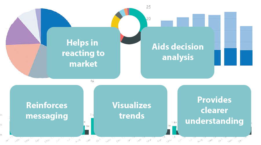
Reinforces messaging
Visual resources have a greater impact than any text-based resource since they are much easier to comprehend and remember. Using dynamic images to support your statistics and information helps your audience understand the point you’re trying to make.
Having said that, it is equally crucial to select the appropriate visualization for the information you are presenting. Visualizations done incorrectly or poorly confuse and overwhelm the viewer, which is wholly ineffective.
Data Visualization and trends
The capacity to recognize various trends across time is one of data visualization’s most evident but important advantages.
You need to use your historical and current data in order to estimate your items, sales, or any other KPI. You can learn everything you need to know about your present industry position and what you might be able to accomplish in the future by identifying current trends and projecting future ones.
Provides clearer understanding
You can quickly handle a lot of information thanks to data visualization, which gives you accurate and in-depth insights into the crucial areas of your organization. Additionally, it enables you to successfully and clearly communicate all of this information to your audience.
The most important stakeholders aren’t necessarily knowledgeable about every facet of their organizations. When done correctly, data visualization gets leaders up to speed on all KPIs, enabling them to act swiftly and intelligently. In that regard, data visualization is also one of the most important tools for bridging departmental gaps inside a company.
Helps decision-makers react to the market
Analysts and decision-makers may react swiftly to any significant changes and avoid mistakes when a company’s KPIs are reliably tracked and clearly shown on practical real-time dashboards.
Early trend detection enables companies to take appropriate action – to ride or exit a market wave metaphorically — in order to maximize gains or minimize losses.
Aids decision analysis
Major commercial decisions are now rarely made on a whim, but rather are the result of thorough evaluations supported by the available facts and information. The greatest decisions are made for your organization when these assessments are then represented through precise, unbiased visual tools.
Since accurate results must constantly be communicated, it is crucial to incorporate complete, unbiased data into your decision-making workflows as well as to consistently and dynamically update charts and graphics.
It can help you win favor with Google
You may improve your SEO tactics and attract more visitors to your website by using data visualization.
Without data research, it is impossible to determine which SEO keywords are most effective for your website. When your website has the most relevant keywords, Google considers it to be relevant and moves it up the SERP ranks.
Data visualizations will not only show you which keywords are bringing in the most hits immediately, but also which ones are keeping visitors on your page. These are additional elements that influence how favorably Google algorithms assess your website.
It’s interesting to note that Google has seen a rise in demand for visual representations. So long as your website provides users with what they’re looking for, you’re good to go.
Data Visualization helps you understand your weaknesses
Data may keep your organization from going backward in addition to assisting you in moving forward.
Data visualization makes sales slumps or peaks in consumer complaints obvious. You can determine what went wrong and how to prevent it from happening again by paying attention to these and looking for matching elements.
Graphs and charts clearly show where the strong and weak points of your company are, allowing you to concentrate more on the areas that require attention.
By gathering information about your rivals, you can quickly identify the areas where they are outperforming you and take the initiative to close the gap.
Small details like how frequently they write blogs and promos, the types of people they target, and how they use social media can tell you a lot about why they are outperforming you in some areas.
Data Visualization can help you predict the Future
Data specialists excel at identifying patterns in your sector and business. You can practically look into the future and make plans as a result of their work.
They organize the data and make sense of it so that it serves your corporate objectives. You can make plans using a visualization that demonstrates higher sales of one product in your industry at a specific time of year. To draw in more customers, you can place additional orders for stock and step up your marketing efforts there.
You might stock up on towels or sarongs as ancillary items to boost sales if you anticipate selling more bikinis in March. You might promote giving away a bottle of sunblock with every transaction. It goes without saying that planning is lot simpler when you are aware of what is coming.
On the other hand, you can discover that customers purchase winter goods in the summer in an effort to profit from lower costs.
Avoid assuming anything about your business. Without evidence to support it, it’s impossible to forecast how customers will act.